Showing posts with label Kellie Chasse. Show all posts

Monday, September 8, 2025

When to Leave It In… or Leave It Out – Watercolor Lessons from Monhegan Island, Maine

When to Leave It In… or Leave It Out – Watercolor Lessons from Monhegan Island, Maine

There’s a quiet kind of magic to painting coastal Maine — the way the light dances off the water, how the grass moves in the breeze, and the peaceful charm of those tucked-away island homes.

In my latest Patreon tutorial, I painted a scene from beautiful Monhegan Island, complete with ocean views, wildflowers, and a sweet little cottage. And right in front? Two Adirondack chairs — the kind that beg you to sit for a while and just be.

But here’s the thing… those chairs gave me trouble.

Original Painting in Etsy Shop

I traced them in to keep it simple, but since I painted the scene fairly small, they still got a bit lost. There just wasn’t enough room to include the detail I was hoping for — and they started to feel more like a distraction than part of the story.

Looking back, I probably should’ve outlined them with a fine Sharpie and added just a light wash — something to suggest them without needing much. But hey, that’s part of the process. We’re always learning.

And the beauty of being the artist?
You get to decide what stays and what goes. You’re not locked into the reference photo. You can simplify, shift, or completely change course if it helps tell the story you're aiming for.

So that’s exactly what I did: I painted the scene a second time.
This time? No chairs.

Just the view, the sky, the garden, and the stillness. It felt just as peaceful — maybe even more so. And it reminded me how freeing it is to paint something twice and let it evolve.


Monhegan House, Maine Coast

💡 Artist Tip:
When painting small and dealing with detailed objects (like chairs or windows), simplify. Try outlining them with pen and using a soft watercolor wash instead of overworking tiny brush details.


 Patreon-only tutorial, I share:
– Layering skies and coastal grasses in watercolor
– What made the chairs tricky, and how I handled them
– My choice to revisit the painting with a simpler version
– Encouragement to trust your own creative decisions

The full-length video, traceable sketch, and reference photo are available now for my Patreon members. If you're looking for a relaxing project and a bit of behind-the-scenes honesty, this one’s for you.


Want to paint along with me?
Join me on Patreon where I share exclusive full-length tutorials, downloadable extras, and behind-the-scenes lessons from my watercolor journey:
👉 Patreon.com/KellieChasseFineArt


Monday, August 25, 2025

Mastering Rocks in Watercolor – My Top 5 Tips

Mastering Rocks in Watercolor – My Top 5 Tips

If you’ve ever found yourself staring at a rocky shoreline wondering how to paint all that texture without turning your watercolor into mud… you’re not alone


Here are 5 quick tips from the session to help you rock your next rocky scene:

1. Dry Brush for Texture

Use a mostly dry brush with very little water to create the rough, uneven textures rocks are known for. It’s perfect for suggesting cracks, veins, and grit without overworking the surface.

2. Layer with Purpose

Start light and gradually build your darks. I used splattering and layering techniques to create depth — especially with cooler grays and warmer earthy tones mixed in.

3. Liner Brush Magic

A liner brush is your secret weapon for those fine, jagged lines and textures in the rocks. Try switching directions with your strokes and don’t aim for perfection — messy often looks more real! I love my new Lenbenzon Brushes for this. They have such a nice fine line and hold a lot of paint. If you are interested in them, they have offered up a coupon for my followers this month:  20% Off - Use Code: KELLIE here!

4. Add Contrast with Pen

Once everything is dry, come in with a fine point Sharpie to highlight some of the deeper cracks and crevices. This adds a beautiful bit of contrast and keeps the viewer’s eye moving.

5. Don’t Be Afraid of Splatter

Controlled splattering with a toothbrush or your finger can add some grit and natural variation. I used it a few times in this piece to really make the rocks feel rugged.

If you’re a Supreme Patreon member, the full replay is now up! I walk through each step, chat about color choices, and share the exact brushes and colors I used. If you’re not a member yet, I’d love to have you join us and paint along!


Friday, August 15, 2025

Painting the Coast of Maine : A Watercolor Day at Wolfe’s Neck State Park

Painting the Coast: A Watercolor Day at Wolfe’s Neck State Park

If you've ever wandered the trails at Wolfe’s Neck State Park in Freeport, Maine, you already know how special it is. The rocky shoreline, the way the trees bend toward the water, the bright green against that bold Atlantic blue—it’s one of those places that just asks to be painted.

This watercolor was inspired by one of my visits there. I always bring my sketchbook and a little paint kit with me, just in case the mood strikes (and at Wolfe’s Neck, it always does). On this particular day, the light was perfect. The tide was rolling in, and the green on the cliffs felt extra vibrant. I knew I wanted to capture that moment—the stillness mixed with the movement.

Original Painting Available in my Etsy Shop

I kept the painting loose and fresh, layering watercolor washes to build up those beautiful contrasts. A little pen and ink added some crisp edges and textures to the rocks. It’s one of those pieces that makes me feel calm every time I look at it, like I can hear the waves again.

If you’ve visited Wolfe’s Neck or just love Maine’s rugged coastlines, this one might speak to you too. It’s now available in my shop as a framed original, ready to hang. Perfect for anyone who needs a little piece of Maine on their wall.

And if you're curious how to paint places like this yourself, I have some beginner-friendly classes where I walk you through simple landscapes, layering techniques, and working with nature as inspiration. (Feel free to check those out on Patreon or my website! 

Have you ever been to Wolfe’s Neck? Or do you have a favorite coastal spot you’d love to see turned into a painting? I’d love to hear.

Stay creative,
Kellie

Friday, July 18, 2025

How to Paint Coastal Lupines in Watercolor – Depth, Movement & a Little Maine Magic

How to Paint Coastal Lupines in Watercolor – Depth, Movement & a Little Maine Magic

There’s something magical about lupines blooming along the Maine coast. They’re wild, imperfect, and always moving—like they’re dancing in the wind. Every year when they show up, I feel this quiet pull to paint them.

But painting lupines in watercolor can feel intimidating at first. All those little shapes, overlapping leaves, and shifting colors—it’s easy to overwork them or get caught up in the details. That’s why I wanted to share some helpful tips for capturing them in a way that feels natural, loose, and fun.

You can watch the tutorial for this one on youtube HERE.

 Etsy Shop 

Start with the feeling, not the flower

Instead of focusing on exact shapes, begin by asking: What’s the mood I want to create?
Coastal scenes often have movement—wind in the trees, light in the sky, a breeze rolling over the water. Try to build that into your piece through your brushwork and color transitions. Let the sky blend softly. Keep your trees a bit blurry in the distance. Let the background recede so the flowers can shine.

Work from soft to bold

Lupines look best when they pop against a calm, layered background. I usually start by laying in a light wash for the sky, then adding soft distant trees using wet-on-wet or lifting to create texture and depth. This makes your purples and greens really stand out when you get to the flowers.

Layer your color with purpose

Purples can get muddy fast, especially when mixed with too much green. So take your time layering. Let the first layer dry completely, then build the richness by glazing purples and adding shadows with a bit of Payne’s Gray or Ultramarine Blue.

Tip: Don’t forget to mix some cool and warm greens to create a more natural look—nature rarely sticks to just one shade.

Suggest, don’t overdefine

Lupines have a unique structure, but you don’t need to paint every petal. A few well-placed strokes and suggestions are enough. Leave some white space, break up your shapes, and let your viewer’s eye fill in the rest.

Let go of perfection

This is something I come back to in almost every floral or landscape I paint. The most beautiful pieces often come from looseness, play, and letting watercolor do what it does best: move freely.

When in doubt—use more water, step back often, and trust the process.


Final Thought:
You don’t need to be an expert to capture something beautiful. You just need to show up, stay curious, and be open to surprises along the way. Whether you’re painting Maine’s coastline or your backyard blooms, lupines are a lovely reminder that wild and imperfect can still be absolutely stunning. 

Want to go deeper?
If you’d like to see the full, extended version of this painting—along with the real-time process, traceables, and access to my growing library of watercolor tutorials—you’re invited to join me on Patreon. It’s where I share the behind-the-scenes, the messy middle, and the real-time magic of watercolor. I’d love to paint with you there!

💜
Kellie

Monday, July 14, 2025

Painting Loose & Expressive Rose Watercolor Florals – Letting Go of Perfection

Painting Loose & Expressive Watercolor Florals – Letting Go of Perfection

Do you ever feel stuck trying to make your watercolor flowers look just right? Maybe you’re fussing over every petal, getting tight with your brushwork, and before you know it — you’ve lost that soft, painterly feel you were going for.

Trust me, I’ve been there. But here’s the secret: expressive florals aren’t about accuracy — they’re about feeling.

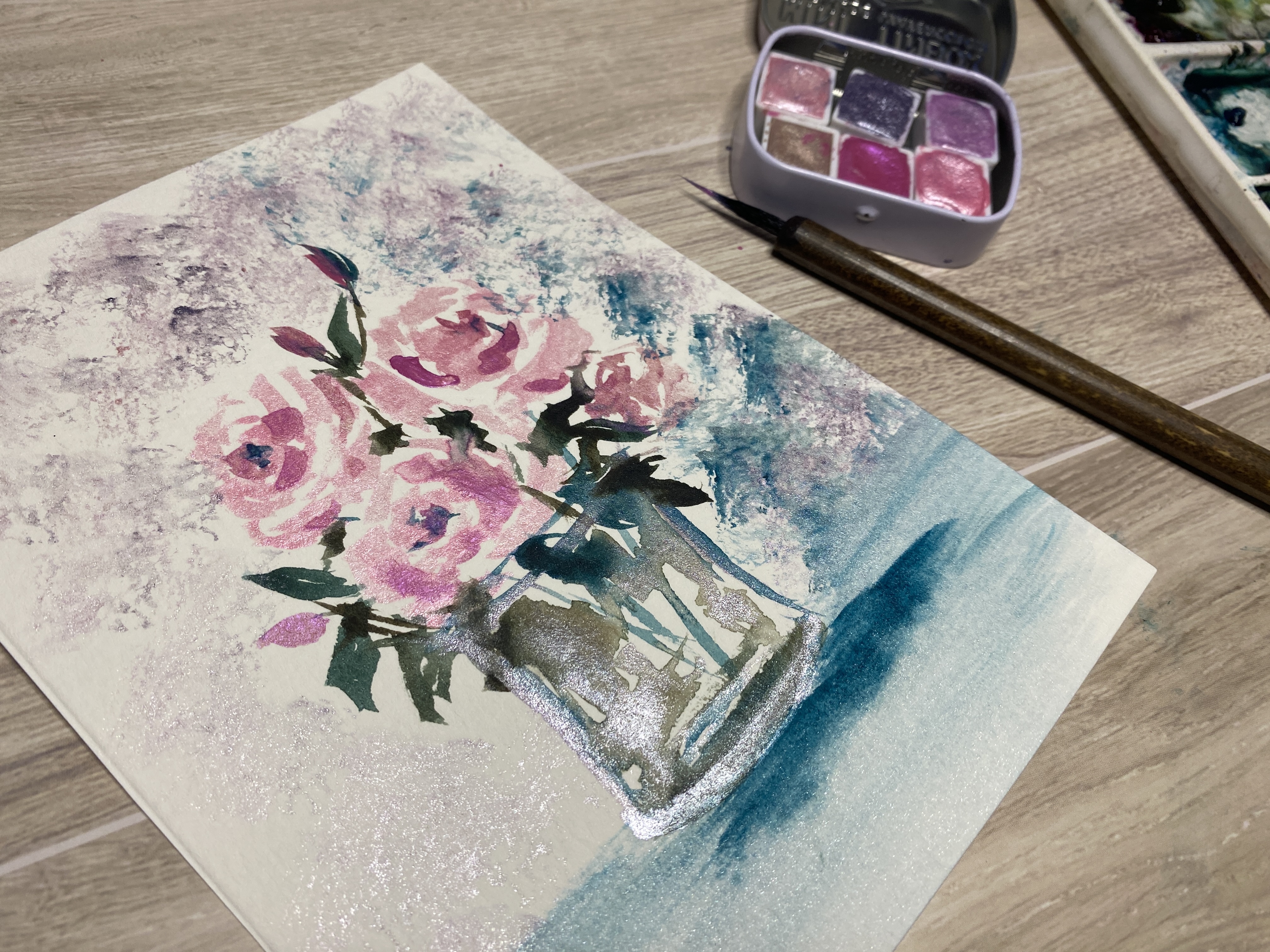
This week, I painted a bouquet of pink roses straight from my garden — and I kept it loose, messy, and playful. No sketch, no pressure. Just water, pigment, and movement.


You can watch the full tutorial on YouTube.

Here are a few tips that might help you loosen up, too: 

1. Start with Shapes, Not Petals

Don’t try to outline every flower. Instead, think in loose, blobby shapes — let your brush dance in circles, soften edges with clean water, and suggest where the flower is without over-explaining it.

2. Work Wet into Wet First

Get your paper damp and drop in color. Watch the paint flow and bloom. This is where the magic of watercolor really shines. You can add sharper details later — but that initial softness gives life to your florals.

3. Limit Your Palette

Too many colors can overwhelm. I like to pick 2–3 main shades (for this rose piece I used pinks and greens) and work with those. It keeps the piece cohesive and frees you up from decision fatigue.

4. Add Some Drama with Contrast

Dark leaves, bold stems, or a strong background shape can help your flowers pop. Don’t be afraid of darker tones — they give your light petals something to shine against.


5. Want to Add a Little Sparkle?

In my extended version for patrons, I added handmade metallic watercolor for a soft shimmer. It’s subtle in the light but brings an extra layer of interest and joy to your work.


This tutorial is up on Patreon now for my members! We paint the same bouquet twice: once with traditional watercolor, and again with metallics for that extra glow. You'll learn:

  • How to paint a loose glass vase

  • Creating florals without a sketch

  • Balancing bold and soft edges

  • Building confidence through expressive strokes

You can join and watch here: Patreon – Kellie Chasse Fine Art


Friday, July 4, 2025

Loose Florals with Pen & Ink Doodles – Embracing Simplicity in Watercolor

Loose Florals with Pen & Ink Doodles – Embracing Simplicity in Watercolor

Lately, I’ve been leaning into simple joy in my painting practice—loose florals, light washes, and a little pen and ink play. There's something really freeing about not overthinking it.

This floral piece started as a quick sketch with a basic pencil outline, followed by light layers of watercolor. I let the colors blend softly and imperfectly—because that’s kind of the point. Once it dried, I added loose ink lines and just a touch of shimmer in the center to bring it to life.

There’s no pressure to make it "perfect." That’s what I love most about this kind of work—it's more about the feeling than the outcome. A reminder that art doesn’t always need to be detailed or polished. Sometimes the most meaningful pieces are the ones that come from simply sitting down, putting brush to paper, and letting your hand move freely.


If you'd like to see how this piece came together, I shared the full process in a video on my YouTube channel. You can watch it here!

Let me know if you’d like to see more like this—step-by-steps, classes, or behind-the-scenes thoughts while I paint. I always enjoy sharing what I’m exploring in the studio.

💛
Kellie

Tuesday, July 1, 2025

Setting Up a Still Life & What I’ve Learned Along the Way

"Garlic & Grace" – Finding Beauty in the Everyday

Sometimes inspiration shows up when you least expect it. Garlic & Grace started as a quiet moment in my kitchen. I was sipping a glass of wine, setting a rose in water, and pulling out garlic for dinner. But when I saw the way the light hit the counter, I stopped everything and grabbed my camera—and eventually, my brushes.


🧄 What Makes a Still Life Work?

Over the years, I’ve found that still life setups don’t need to be complicated. Here are a few tips I’ve learned while working on this piece:

1. Start with What You Have

Fresh produce, glassware, flowers—even kitchen scraps—can be beautiful with the right lighting. Use what feels personal or meaningful.

2. Look for Contrast

The rough texture of garlic skins next to a delicate rose, or the soft curve of a glass catching light, adds visual interest and tells a story.

3. Keep It Simple

Too many elements can feel cluttered. I focused on three: the garlic, the rose, and the wineglass. Odd numbers tend to work well visually.

4. Use Natural Light

Soft window light gives a sense of calm and realism. Morning or late afternoon light usually works best (and has a lovely golden glow).

5. Take Photos First

Snapping a few reference shots helps you remember the composition and lighting if you’re not painting it immediately. Plus, it lets you relax and enjoy the setup.

🎨 What I Learned from This Piece

  • Don’t overthink it. Beauty really does live in those small, everyday moments.

  • Let your environment inspire you. You don’t need a fancy setup—just a little intention and curiosity.

  • Keep playing. This still life reminded me how important it is to pause and see before jumping into the painting.


If you’d like to watch the painting process, I shared the full real-time demo as my July Patreon exclusive. It’s called Garlic & Grace, and you can find it here if you're a member.

Friday, June 27, 2025

What Salt Can Teach Us About Creativity - using with Watercolors

A simple watercolor trick with surprising lessons

This week in the studio, I played with one of my all-time favorite watercolor techniques—salt. Yep, good old salt.

Whether it’s sea salt, table salt, or something in between, adding it to wet watercolor can create the most amazing organic textures. And beyond the pretty patterns, this little experiment reminded me of something bigger: creativity doesn’t always need a plan.

In my new Patreon video tutorial, I tested a few types of salt to see how they react with different paint consistencies and paper types. The results were all over the place—and that was the fun of it. Each one had its own unexpected magic.


This is one of those go-to exercises I love for:

  • Loosening up when I’m feeling stuck

  • Getting back into a playful mindset

  • Letting go of the need to control every outcome

For anyone who teaches art, licenses their work, or just needs a reset creatively, this kind of practice is gold. It’s simple, affordable, and totally beginner-friendly—plus, it’s great for demos, workshops, or just getting re-inspired when the creative tank feels low.

🎥 Curious? You can catch a sneak peek here!

And if you want the full, extended video, including my notes on materials and what worked best, you’ll find it over on my Patreon page.

Here’s to more experiments, more messes, and more letting go in the studio.

💛
Kellie

Thursday, May 8, 2025

Mastering Water Reflections in Watercolor (and How Gouache Can Help You Fix or Finish)

Mastering Water Reflections in Watercolor (and How Gouache Can Help You Fix or Finish)


Creating realistic water reflections in watercolor can be one of the trickiest techniques to master. Water is fluid, reflective, and constantly changing—capturing that with a brush takes a mix of observation, layering, and patience.

My Tips for Painting Reflections:

  • Start light: Lay in your base water tones using wet-on-wet to keep things soft.

  • Mirror shapes: Whatever’s above the waterline gets loosely mirrored below—but soften the details.

  • Pull down and blur: Use a damp brush to gently pull color downward while the paint is still damp for that natural ripple look.

When It’s Not Working…

Sometimes reflections end up too dark, too harsh, or just off. That’s where gouache can be a lifesaver.

  • Use white gouache to pull back highlights or add ripples.

  • Mix gouache with your watercolor paints for softer, more matte adjustments that sit on top of the paper.

  • Think of it as layering light on top, especially useful for sparkles, boat highlights, or cloud breaks.

Watercolor is about letting go of perfection—but also knowing when to grab a tool like gouache to guide things back.

If you’ve struggled with reflections, you’re not alone. I just finished a painting of Bunker Harbor that had me rethinking every brushstroke on the water. But I stuck with it, used a little gouache magic, and now it’s one of my favorite pieces.

Check out the Video for this painting Here and you can purchase this painting or prints in my Etsy Shop! 

Happy Painting,

Kellie 

Wednesday, April 9, 2025

The Power of 5-Minute Watercolor Studies: How Quick Painting Can Transform Your Art


We often think that improving our watercolor skills requires long, dedicated sessions at the easel. But what if I told you that some of the most effective learning happens in just five minutes a day?

This month, I’m diving into quick 5-minute watercolor studies as part of my April Challenge, and I’d love for you to join me! 🌿🎨

Why 5-Minute Watercolor Studies?

Short, intentional painting sessions help us in so many ways—whether you’re a beginner or a seasoned artist. Here’s why making time for just five minutes a day can transform your creative practice:

1. Overcome Perfectionism

When you only have five minutes, there’s no time to stress over every detail. You learn to let go, trust the process, and embrace imperfections, which often leads to more expressive, spontaneous work.

2. Build a Consistent Habit

Sometimes, the hardest part of painting is just starting. But when you know it’s just five minutes, it feels easy to commit! And the more you show up, the more progress you’ll see.

3. Train Your Eye & Hand

Quick studies sharpen your observation skills and improve your brush control. Whether it’s capturing light, mixing greens, or creating texture, repetition builds muscle memory.

4. Unlock Creativity Through Play

In short sessions, there’s no pressure to create a masterpiece. Instead, you can experiment freely with colors, shapes, and techniques—leading to happy accidents and new discoveries.

5. Reduce Creative Blocks

Feeling stuck? A small, no-pressure painting session can reignite your creative spark and help you push through resistance.

Join the April Watercolor Challenge!

This week, we’re exploring different shades of green with a variety of fun, bite-sized prompts:

🖌️ Tiny forest scene
🖌️ Meadow with wildflowers
🖌️ Sprouting seed or new growth
🖌️ Green critters (frogs, turtles, lizards)
🖌️ Misty green hillside
🖌️ Free choice or catch-up day

You can paint along with me in my latest YouTube video—a collection of quick demos to inspire your daily practice. Watch it here! 

And if you’d love extra feedback and support, my Patreon members get access to the full-length versions of these tutorials!

Let’s paint, experiment, and grow together. Share your work using #AprilNatureWatercolors so we can cheer each other on!

Happy painting,
Kellie

Wednesday, March 19, 2025

Unlocking the Magic of Ox Gall in Watercolor Painting


If you’ve ever struggled with getting your watercolor paint to flow smoothly or blend effortlessly, you’re not alone! Watercolor is all about movement, but sometimes the paint just sits stubbornly on the paper. That’s where Ox Gall comes in—a little-known but powerful medium that can transform the way your paint interacts with water.

What is Ox Gall?

Ox Gall is a natural wetting agent derived from animal bile (though synthetic versions are also available). It reduces surface tension, allowing watercolor to spread more freely across the paper. This makes it especially useful for artists who:
✔️ Want smoother blends and transitions
✔️ Paint on harder-sized papers where water tends to bead up
✔️ Love creating misty, ethereal effects

How I Tested Ox Gall in My Watercolor Painting

For my latest experiment, I created a quick forest scene, focusing on how Ox Gall affects paint movement and blending. Here’s what I found:

🖌 Increased Flow: Paint glides across the paper more smoothly, making washes look effortless.
🌊 Softer Transitions: Perfect for misty landscapes, foggy backgrounds, and dreamy skies.
💧 Controlled Spreading: Unlike just adding more water, Ox Gall helps the paint move without losing vibrancy.

Want to see the full process? Watch my latest YouTube video here: [Insert Link]

How to Use Ox Gall in Your Paintings

  • Mix it in your water before painting for an overall effect.
  • Apply it directly to your paper in certain areas where you want more flow.
  • Experiment with different amounts—a little goes a long way!

Ox Gall vs. Blending Medium – What’s the Difference?

While Ox Gall improves paint flow, blending mediums (like the one from Winsor & Newton) are designed to slow drying time, allowing for longer blending windows. If you’re looking for softer edges and gradual transitions, Ox Gall is the way to go. But if you need more working time before the paint dries, a blending medium might be the better choice.

Final Thoughts – Should You Try It?

I’ve been testing Ox Gall for a while now, and I love the natural, flowing effects it creates in my watercolor paintings. It’s a great tool for artists who want to loosen up their work while maintaining control.

Want to give it a try? Test it out on some scrap paper before using it on a finished piece, and see how it changes your process!

Have you used Ox Gall before? Let me know your experience in the comments!

🎨✨ Want more watercolor tips? Join me on Youtube for more tutorials!

Wednesday, March 5, 2025

The Joy of Painting Bigger: Why I’m Loving Going Larger


For years, I primarily painted small. There were a lot of practical reasons for it—smaller pieces are more affordable for buyers, require fewer supplies, and are much easier (and cheaper) to ship on Etsy. When I showcased my work at the Portland Jetport, smaller paintings were perfect for travelers who wanted to take a piece of Maine home with them without worrying about space.

But lately, I’ve been embracing painting bigger—and I have to say, I LOVE it! There’s something incredibly freeing and fulfilling about working on a large scale. Some of my favorite paintings are my bigger pieces, and I’ve been wondering why that is.

Why Painting Bigger Feels So Good

  1. More Room to Express – With a larger surface, I can explore more textures, movement, and detail. There’s no need to hold back—I can let the brush flow freely and make bolder strokes.

  2. A Different Kind of Energy – Big paintings command attention. They have a presence that smaller pieces just don’t. When I step back and see a large piece coming together, it feels powerful.

  3. Self-Fulfillment Over Practicality – While small paintings make sense for selling and shipping, there’s something deeply satisfying about creating without limitations. Painting big allows me to push my creativity further.

  4. More Immersive Experience – When I paint on a larger scale, I feel more connected to the process. I’m moving more, stepping back often, and fully engaging with the canvas—it becomes a whole-body experience!

Finding the Balance

Of course, I’ll still continue to offer smaller works for those who love them (and I do still love them, too!). But having options and allowing myself to enjoy the process of painting larger has been a game-changer. It reminds me why I fell in love with painting in the first place—to create freely, without restrictions.

So, if you’ve been thinking about going bigger, I say go for it! You might just find that your favorite pieces are the ones where you gave yourself the most space to create. If you are unsure about painting larger, then come join me on Patreon, where we'll be painting a larger watercolor LIVE, March 16th and you can follow along! 

Do you prefer painting big or small? Let’s chat in the comments!

Tuesday, August 2, 2022

Watercolor money saver masking hack!


Not sure if you feel the same way, but summers always tend to be my downtime creatively.
I am definitely not lazy, just enjoying my family, the outdoors, and my gardens. The lupines have gone by and are just about to turn to seed so I can replant soon. 

I've been testing out something pretty cool this week! 

You know that masking fluid is pretty expensive and comes in the smallest jars right? Well, I thought I would give regular old monster latex a try in place of my Winsor and newton masking. I decided to use some Strathmore watercolor cards to start. Tested both of them three ways just to make sure. 


1. For the first test I let both the winsor and monster dry naturally on the paper. 
2. I used a heat gun to dry ( I wanted to see if it would adhere to the paper and not come off as easy.
3. Let the masking dry and sit for over a week before I attempted to remove it. 

You can watch the new money-saving test that I did with Monster Liquid Latex vs. Winsor Newton masking, it worked great. 

Watch the video over on my youtube channel. 

It's a huge saving. (16 oz of Monster is $12.95 vs 16 oz of Winsor Masking would be over $85.00.)


Well during that test, I felt the urge to paint from this gorgeous reference photo that my friend, Benjamin Williamson took (which you can purchase by the way if you don't want to paint it).

This painting is loose and fun, and I hope you'll join me and paint along. I've added it as a new course on my website, and it will be going up on skillshare soon if you are a member there. 

Hope to see you inside the course! 

XOXO,
Kellie 

Wednesday, April 21, 2021

Special Watercolor tags to spice up your package or gifts!


Special Watercolor tags to spice up your package or gifts!


Supplies needed: 
Scrap pieces of watercolor paper, Watercolors, String, Craft scissors, and a whole puncher.


Cut out any shape you like, I decided since it's Mothers Day coming up soon that I would cut out that classic heart shape. The design and holidays are endless so do what fits you. Think about it, you could cut out Shamrocks, Easter eggs, Trees, Leaves,  Xmas Stockings, or ornament shapes....the list goes on. 


Once your shape is cut out add some watercolors, and have some fun. You could even add some pen and ink abstract details to yours once it's dry. I like to leave it blank so I can fill in a little note with a black sharpie or white gel pen.


Then use a hole puncher to create a space to thread your string, ribbon, etc through and tie it to your package. I love to use just plain craft paper, but again use anything you like.

Feel free to leave a comment below and let us know what special little touches you like to add when you package your gifts or art?


Sunday, April 4, 2021

Are you joining us for the April Flower Challenge this week?

Happy Easter Creatives!

Are you joining us for the April Flower Challenge this week?

Day 1 (today) is painting a Daisy. I love these flowers so much that back in 2009 my hubby bought me 1000 Daisies!  I had to use every vase and mason jar in my home. Plus my neighbors got a few little bouquets too. 


My original plan was to share part of my painting process live on Instagram, but you know how things work out! Had some time yesterday so I created a full 25-minute video on youtube instead that I hope you'll enjoy! If you plan on joining the challenge, make sure to leave a comment over there on youtube! 

PLEASE JOIN US and practice your flower skills!

Materials I used for this one:
Watercolor Cotton Paper by Legion, Winsor Newton Watercolor Cotman kit, and a size 10 Black Tulip brush. 

Use #flowerchallengekc on Instagram and tag me in your stories so I can see them @KellieChasse_FineArt, hope to share some of yours. Here is the List of flowers you can paint each day. Feel free to use any medium you like. 


Tomorrow's flower is the Sweet Pea, hope you'll give them a try!
Feel free to share this email with your creative friends and family members to paint along with you in the challenge.
 

XOXO,
Kellie​

Tuesday, October 27, 2020

Experimenting with Funkadelic Liquid Dichro Inks - Chills and Thrills


Experimenting with Funkadelic Liquid Dichro Inks - Chills and Thrills!
These have some color shift and are interesting to work with, very pretty.
They come from a very small company run by Erbie, and she mixes all of these herself with a little help.

She released the colors last October, and I finally purchased some to try out. Heads up the website is a bit tricky, so make sure you look at where you are shipping to.


You can find them here.
You can mix your own shimmer inks too, and I have a course on that!

Thursday, October 22, 2020

Alcohol Ink Paper by Grafix Dura-Bright- Surprise Technique with Hand Lettering.

Quick and Fun Project for you!


Hi Art Peeps!

I wanted to share a quick and fun project with you. It's super fun and easy by the way, think how cool this would be for each month of the year. I did this project with Trex Alcohol inks, but you can also try it with watercolors on watercolor paper!

Special thanks to Grafix paper  for sending me some different papers to try out with some alcohol inks. The Dura-bright in Black will be out in stores soon. Write out your word with some craft glue then add some heavy coarse salt on top.

No need to wait for it to dry, just start adding your alcohol inks over the salt and let dry.

You can use some canned air to blow the ink around for a lovely background

Snowcap or Blanco works great to make the colors really pop since they make them more opaque.

You can find a full list of supplies in the description box on youtube. 

Put it in a frame once it's dry and you have a lovely little sign for your home.


I would love it if you shared your finished piece on Instagram and tagged me @kelliechasse_fineart

Happy Halloween!

XOXO,
Kell

Thursday, October 8, 2020

LIVE ZOOM PAINT PARTIES!

I have taught LIVE watercolor classes locally for corporate events, fundraisers, private home parties, Hobby lobby, Joanne Fabrics, and Adult Education.

Last night I did my very first ZOOM virtual paint night as a test and I have to say, I've missed the live interaction with all of my students. This was so much FUN!!

I'm now thinking that during the Winter I'll be doing some private paint parties. I'll be posting more information about the LIVE events on my Instagram page.

I'll have to try it a few times more I'm sure to really get the hang of it. Not sure why it's taking me so long to give this a go. These ladies really enjoyed it, and it gave us all the one on one connection even though we are miles and miles apart.

Also wanted to share that my new BEE CREATIVE ALCOHOL INK Course is up and running now on my website and I hope to add it here to Udemy next month. Here's a peek at it.

This will be one of my longest courses so far with over 20 lectures and 2 hours of video content. You know that my courses don't have a lot of FLUFF, because I edit out most of that "WAIT TIME" for you.

There is a FREE tutorial on my youtube channel from the class, so you can try out this little coneflower using some alcohol ink techniques like stippling and lifting.

Feel free to reach out to me with any questions!

Have a creative day,

OXOX

Kell

Wednesday, May 27, 2020

Watercolor Earrings (LIVE)


What a fun project I finished up today.

You can watch the entire Free tutorial on youtube where I have all the links available for you!


I started out with some 140lb cotton watercolor paper and created my leaf shape. I tried a few different brushes a few weeks ago to see which one created an easy leaf. I also have a youtube video on this if you want to make easy leaf shapes. 


Cut out the shape using scissors and add some black pen and gold pen details for a little bling.
Next UV resin on both sides, it took about 4 minutes on each side to cure. 


Once the uv resin was dry use a Dremel tool to create a small hole near the top for the jump ring to hang and added a small earring.


Creating Rock Texture in Watercolor – Inspired by a Cadillac Mountain Sunrise

Creating Rock Texture in Watercolor – Inspired by a Cadillac Mountain Sunrise Painting light, contrast, and texture without overworking you...